design system
How can we design a way for customers to purchase what they want without trial and error?

Improved Design System for Amazon shopping app for 150 million customers to shop efficiently and easily access new technology under Agile sprint
MY ROLE
Orchestrated workshop for generating solutions
Ideate, published design system as an only designer
Collaborate with PM, SW engineers, and UX researcher
Research, Design, Prototyping
Problem


Too many notifications detract the shopping experience
Inconsistent design element that confuse customers
Guidance using technical terms difficult for customers to understand
"Too many notifications that look alike detract from the shopping experience."
"I don't know how to manipulate the new features."
- User interview

Process
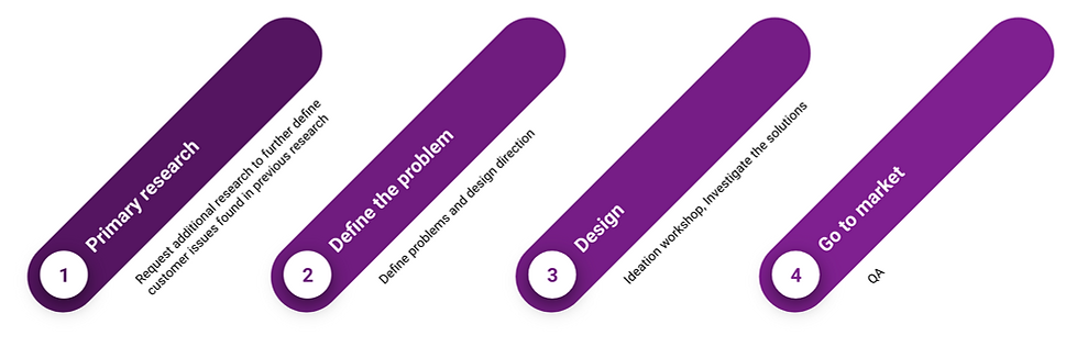
Plan
List up the customer problems from the survey
Prioritize customer issues with the PM based on the data
Sprint planning based on the priority with PM, SW engineers
Research
Found there are too many notifications and alerts and they detract from the shopping experience. Customers tend to skip notifications and alert shorter than 3 seconds despite taking three seconds to read a simple text.
In addition, found inconsistent design system and unfriendly guidance with technical terms.


Design
Ideation workshop
-
Share customer problems and customer problems
-
Various potential solutions
Suggest various solutions
-
Minimize notification until the customer starts the shopping experience in earnest
-
Use natural language like view instead of technical terms like scan

workshop image from the web because of confidential issue
Iterate the design
Design revise considering development difficulty and impact
ex. Decided not to customize error pop-ups encountered by less than 1% of customers
Discuss with UX writer for customer-friendly guidance
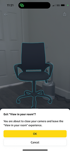
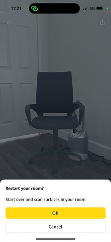
InsigHt #1.
Experience first
Reduce steps for first-time customers
Found that there are 9 attentions to customers who are experiencing AR for the first time and I found there are redundant guides.
To solve this, focus on letting customers enjoy their first-time experience with placed products, and provide guides after that. Once the customer has decided where to place the product, firstly just show the product for 4 seconds. After that, if the customer is a first-time user and the customer has not interacted with the produuct during this session, display the interaction guide.
Before
11 flows and 9 attentions before exploring the new feature for the first time

After
Reduced to 6 flows and 4 attentions before exploring the new feature for the first time
-
Removed redundant guidance
-
Adjusted timing for optional guidance

InsigHt #2.
Consistency and Customer friendly
Refine design system for guidance using customer-friendly terms
Improve readability
Redesigned a design system for notifications for improving readability and usability. Created adjustable based on the customer’s display. Applied padding on both sides to specify the width.
The previous design has fixed max width and height notifications regardless of the customer’s display. It leads to awkward scroll interaction on modal and line breaks. I believe that reducing unnecessary line breaks can improve readability and give a sense of refined design.
Before
Duplicated guidance on the same screen
Inconsistent visual style and layout


After
Revised consistent design system
- Consistent visual languages such as color, icon, components
- Consistent location of design elements such as the height, width, and length
- Redesigned timing for each guidance message
I cannot show the final image here because of a confidential issue, but I believe I can attach refined final images within few months, after updating the Amazon shopping application.

Improve UX writing
Consistent and friendly guidance to resolve the problem situation
-
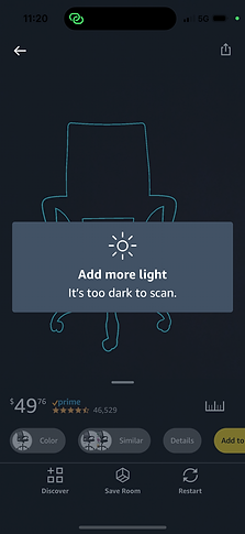
Improved guidance to escape from a problem situation rather than guiding you through a problem situation. Previous guidance provided problems such as 'too dark' and 'too fast' and solutions such as 'move the camera' at the same time. I believe that solutions should be provided first because what matters is letting customers resolve the problem situation.
-
Revised technology terms to user-friendly terms.
-
Removed the period at the title and unnecessary ….
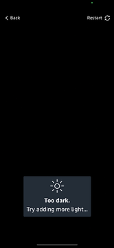
Previous guidance messages
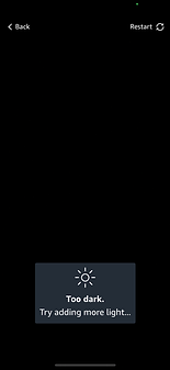
Too dark.
Try adding more light...
Too fast.
Slowly move the camera...
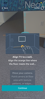
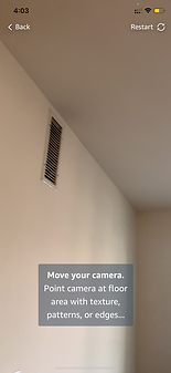
Move your camera.
Point camera at floor area with texture, patterns, or edges...
Find the floor
This surface may not be the floor ...
Revised guidance message
Add more light
It's too dark to scan.
Move slower
It's too fast to scan.
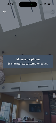
Move your phone
Scan texture, patterns, or edges.
Find the floor
You may not be pointing at the right surface.